

A Complete Chronological Rundown Of Every Live-Action Batsuit
Batman has been around for a long time. In fact, in May of this year, he’ll have been around exactly 82 years since his debut in Action Comics no. 27 all the way back in 1939. And I think it’s fair to say that, over the years, the Caped Crusader has sported an immense variety of looks as different artists have put their own spins on the classic costume.
What is equally impressive is just how many different costumes the World’s Greatest Detective has sported throughout his many years on both cinema and TV screens – a history that is almost as long as his history in print. And seeing as the release of Zack Snyder’s Justice League is finally here, as well as the introduction of a brand new cinematic Dark Knight next year in Matt Reeves and Robert Pattinson’s The Batman (just less than a year to go!), I thought it was high time we had a complete chronological run-down of every single live action Batman suit – covering serials, to TV and movies – beginning with…
The Batman (1943) – Lewis Wilson

This is about as basic as you can get without it being a Halloween costume. Though, given that this first ever live action depiction of Batman debuted only a mere four years after his first comic appearance, it at least looks pretty comic accurate, which I suppose is about as much as you can hope for, given that this was a serial made with probably a fairly minuscule budget. The worst parts are definitely the ears, which just look like random pointy bits of fabric instead of the already-iconic bat shape that had been present in the comics since day one. They’re even asymmetrical. However, I will say the bat symbol does look pretty nice.
Batman and Robin (1949) – Robert Lowery

The 1949 serial is essentially a continuation of the successful 1943 adaptation, though it features a recast of Batman, with Robert Lowery replacing Lewis Wilson as the Caped Crusader (and also a new Robin, with Johnny Duncan replacing Douglas Croft). The costume itself is very, very similar, although somehow, the ears look worse, even though it’s practically the same costume. I don’t have much else to say about this one, given there’s essentially zero differences, other than I think Lewis Wilson filled out the costume a little better, and had a more heroic stature.
Batman (1966) – Test Suit – Lyle Waggoner/Adam West
This is a curious one. Before Adam West was definitively cast as everyone’s favourite campy, “Some days you just can’t get rid of a bomb!” take on the Caped Crusader, he actually was one of two actors to screen test for the role, the other being Lyle Waggoner. These screen tests featured a slightly different costume than the one we all associate with Batman 1966 – the bat symbol is vastly different and doesn’t feature the classic yellow oval, there’s an ill fitting collar that descends from around the cowl over the top of the cape, and the eyebrows appear to be positioned lower on the cowl, as well as possibly less pronounced than the final suit that made its way to the small screen. It’s definitely an interesting curio at the very least, all the more so that it was never seen in the actual show.
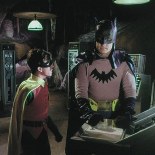
Batman (1966-1969) – Adam West

Honestly, I don’t see how anyone can hate this suit. Sure, it was probably fairly cheap and looks decidedly campy (not that that’s a bad thing), but for better or worse, this is the look that defined Batman for almost twenty solid years, and had a lasting impact in pop culture that extended well beyond the three seasons of the TV show and the theatrical movie – it’s a look that is still associated with Batman over fifty years later (hell, there was even an animated, full-length movie in 2016 that brought back this costume – as well as Adam West, Burt Ward and Julie Neymar as Batman, Robin and Catwoman respectively). Also, it gave us probably the greatest Only Fools and Horses joke of all time (if you haven’t seen it, I’ve included it below for your viewing pleasure).
It’s a rightly iconic costume in my opinion, and fully deserves its place in Batman’s visual history.
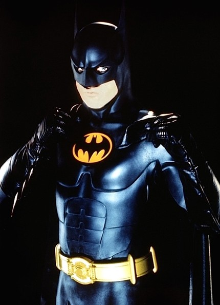
Batman (1989) – Michael Keaton

The other classic, iconic version of the suit is easily Tim Burton’s interpretation. It’s the polar opposite of Adam West’s suit: it’s jet black, aside from the classic yellow oval, has a much more aggressive design, and introduced the idea that a live-action batsuit could be armoured, something that has been the template for most of the suits going forward. The only real caveat I have is the design of the bat logo, which has a weird, triple spike thing going on with the tail that just looks a little awkward, and of course there’s the fact that Michael Keaton couldn’t turn his head. But overall, this batsuit is pretty hard to beat; it just looks terrific.
Batman Returns (1992) – Michael Keaton
How do you improve on Batman 1989, which arguably had the best live-action batsuit to date? Like this, apparently. The cowl and neck area have been improved considerably, featuring a slightly sharper, more angular design. The molded abs have also been replaced by art-deco style armour, which I would say is an improvement. Best of all, the bat logo has been corrected, and now features only a single tail spike, as well as less wispy wings – it’s a much stronger silhouette overall. Aside from that, there aren’t a lot of differences other than improving on the things that needed to be improved, and it’s certainly the better of the two Keaton batsuits in my opinion. And since Keaton is coming back for the upcoming The Flash movie, I can’t wait to see which version of his batsuit they bring back.
Batman Forever (1995) – Main Suit – Val Kilmer

Oh boy, there’s really no avoiding the nipples is there? Much (maybe too much?) has been said about the infamous Bat-nipples, so I’ll just leave it at this: they’re an offensively bad creative choice and really don’t belong on a costume that’s meant to instill fear into the most notorious of criminals. The rest of it is … okay, I guess? The silhouette works, but the whole thing just looks a little flimsy and rubbery, and more like it should be a costume in a relatively cheap theater production rather than a major blockbuster.
Batman Forever (1995) – Sonar Suit – Val Kilmer

Why didn’t they just have Val wear this suit for the entire movie? I know, I know, they needed a second suit because of toy sales, but genuinely, the Sonar Suit is so much better than the one Val wears for most of the movie. The nipples have been entirely banished, and while it’s a little too shiny, it feels a lot more like an armoured suit than the be-nippled, molded abs monstrosity that is the main suit. At worst, it’s a little over designed (no doubt to look good as an action figure rather than a functional outfit), and the Batman logo being repeated on his belt feels like overkill. But otherwise, it’s fine.
Batman and Robin (1997) – Main Suit – George Clooney

Ye gods, why were the nipples un-banished? Did Joel Schumacher learn nothing from the reception to Batman Forever? Clearly not, because they’re back in full force. It’s tough to say which Bat-nipple suit is the worst out of Kilmer and Clooney, because the chest piece appears to be the exact same mold, just fitted to the different actors. The bat symbol also is less pronounced, to the suit’s detriment. Though I will say I like the design of the cowl. It fits Clooney’s face better than Kilmer’s did his. Other than that … what can I say? This is easily my least favourite of the modern suits.
Batman and Robin (1997) – Ice Armour – George Clooney

At least the nipples have been sent back to whatever fresh hell they crawled out of (I’m sorry I keep mentioning them, it’s physically impossible not to). This suit is yet another blatant excuse to sell toys, but honestly, it could be worse. The cowl looks decent and it looks more like a piece of armour again – though the large silver accents across the entire suit do give it a bit of a Power Rangers feel. If the silver parts were black, or grey, it would look much better, especially as the Bat symbol is hugely pronounced across the chest.
Batman Begins (2005) – Christian Bale

An immediate and obvious departure from the, uh, questionable aesthetic of the Schumacher era. Christopher Nolan and Christian Bale’s Batman went for practicality and believability, and it obviously paid off. This Batman looks like he could actually exist, while also preserving the need to be a little larger-than-life – how else are you going to strike fear into the hearts of the worst Gotham has to offer? The only real negative points I have is that the neck on the cowl looks too bulky (and like every other armoured suit, couldn’t move), and it does look a little rubbery at points. The best parts are the ears and general shape of the cowl, which went largely unchanged for the sequel, and the Bat symbol, which is prominent without being swallowed by how black the rest of the costume is.
The Dark Knight/ The Dark Knight Rises (2008/12) – Christian Bale

The best, most practical suit yet, and a stunning costume all-around. Nolan and co. really knocked the design out of the park for The Dark Knight, so much so that when The Dark Knight Rises came along four years later, they didn’t change a thing. Best of all, Christian Bale could actually turn his head with this suit, which is humorously mentioned in The Dark Knight. This suit could really hold up to more intense action sequences as well, something previous armoured suits weren’t the best at. Batman had never looked or moved better, which is fitting, seeing as The Dark Knight remains a masterpiece of the genre. The only thing stopping this suit from being perfect is that the Bat symbol gets lost in the middle of all the segmented torso pieces – if they had gone with it being a dull yellow, like the belt, it might have worked a little better.
Batman v Superman (2016) – Main Suit – Ben Affleck

As much as I praised The Dark Knight’s suit, absolutely nothing can top the main suit from Zack Snyder’s Batman v Superman. It’s by far the most comic accurate, featuring a grey bodysuit in contrast to the all-black ensembles that had pretty much been the standard since 1989, and oh boy does it look fantastic. Batman has never looked so beastly, so intimidating, so utterly badass. This is truly the Dark Knight ripped straight from the pages of the comics and planted onto the screen, in all his brooding, tortured glory. Ben Affleck really sells the physicality, but honestly, he probably could’ve just stood there, not really doing anything, and the costume still would’ve made him look amazing. The cowl looks great, the cape looks great, and the Bat symbol is satisfyingly chunky and very reminiscent – intentionally so – of Frank Miller’s The Dark Knight Returns. To me, this suit represents the absolute pinnacle of Batman’s on-screen evolution, and I’m pretty certain it’ll never be bettered.
Batman v Superman (2016) – Knightmare Suit – Ben Affleck

Straight up, this post-apocalyptic (Apokoliptic?) take on what Batman would look like in a dark future – where Earth is ruled by Darkseid and Superman has fallen to the Anti-Life Equation – looks absolutely amazing. You’d think the regular Batsuit with a leather duster coat, goggles and a scarf over the top of it wouldn’t work, but it does, and provides a refreshing, unique take on the World’s Greatest Detective that I can’t wait to see again in Zack Snyder’s Justice League. It’s a bold look, but boldness is Zack’s forte, and I would say it’s definitely paid off here. Easily one of Batman’s coolest alternate looks.
Batman v Superman (2016) – Armoured Suit – Ben Affleck

You know, there’s definitely a pattern here with Zack and Ben’s Batman and looking friggin’ amazing, and the armoured suit Bruce wears for his cataclysmic dust-up with Superman is no exception. It’s another piece taken pretty much from The Dark Knight Returns (which Zack is obviously a big fan of), and it’s definitely one of those things that transferred beautifully from the page to the screen. The best element for me is the light-up, white eyes, which is the closest we’ve had to the purely white-eyed Batman often seen in the comics (aside from a brief scene in The Dark Knight with the sonar vision, but that had more of a blue tint than being simply white). The rest of the suit is gorgeously chunky, textured,, and entirely believable as something Bruce would don to take on the planet’s strongest being.
Justice League/Zack Snyder’s Justice League (2017/2021) – Main Suit – Ben Affleck

Yet another great suit for Ben Affleck’s burly, imposing Batman. His Justice League suit is very similar to his BvS suit (why would you change something that’s already fantastic?), but it does have a few key differences. The cowl is slightly less bulky, particularly around the neck area, and the molded scowl is slightly sharper. The suit itself also sports more obvious armour, particularly around the stomach, biceps and shoulders. It looks great, and if the original BvS suit didn’t exist, I’d say this is my favourite Batsuit, but as BvS does exist, I very slightly prefer just how intimidating it is.
Justice League/Zack Snyder’s Justice League (2017/2021) – Tactical Suit – Ben Affleck

I’ll admit, the Nite Owl style goggles over the eyes do look a little goofy, but it’s something I can shrug at, and move on. But in terms of a more armoured Batsuit meant for taking on Darkseid and Steppenwolf’s Parademons, it absolutely does the job. To me, it looks a little like something the Batman from Rocksteady’s Arkham Asylum/City/Knight universe would wear, but with obvious DCEU touches like the chunky, prominent Bat symbol. Though, at this point, pointing out that Ben Affleck’s Batman suits look great feels slightly redundant, as they all look pretty exceptional, and this one is no different. Hats off, once again, to the costume department.
Titans (2018-20??) – Alan Moussi

Okay, okay, this one might be cheating a little bit, since the Batsuit seen in DC’s Titans is never seen up close, and has always been shrouded in darkness and shadows, so this photo was taken from a behind-the-scenes video. And to be honest, I can see why you never get a clear look at the suit other than in silhouette. The show’s costume budget clearly did not go into its Batman costume (though other costumes, like Robin/Nightwing, do look pretty good). The ears are misshapen, there isn’t even a Bat symbol, and the whole thing just looks rather awkward. But then again, it was never meant to be seen close-up, so I can forgive that it looks pretty bad.
Gotham (2014-2019) – David Mazouz

Again, this suit wasn’t meant to be seen for any longer than the one shot it’s in, but considering the reveal of Batman is meant to be the climax of the show, it doesn’t look great. The cowl looks weirdly angular and cheap, like it’s someone doing (admittedly good) cosplay instead of a professional production. The worst part is definitely the abs. Which. I mean. They look like a pizza. Pizza abs. I can’t unsee that now. They’re just so distracting from the rest of the costume and drag the entire thing down by a whole bunch. So, passable, but nothing special.
Batwoman (2019-20??) – N/A

The final entry in the “Not Meant To Be Seen For Very Long” category is this Batsuit, which made its debut in the Batwoman TV series. It doesn’t even have someone to wear it, as I understand Bruce Wayne/Batman has gone missing in the CW universe, which Batwoman is a part of. As for the suit itself, it looks okay, but definitely feels fairly basic, and lacks a lot of detail that other suits have had. For example, the abdomen area of the torso is almost completely bare, which cheapens the entire suit in my opinion. Though I do dig the shape of the cowl, and how the sweep of the ears connects to the brow of the mask. The collar, too, is a good take and gives this suit somewhat of a unique aesthetic among the previous suits.
The Batman (2022) – Robert Pattinson

Hey, speaking of collars, Robert Pattinson’s (Battinson?) sports an excellent collar, that really gels with the shape of the cowl and how the cape is draped over the shoulders. As for the rest of the suit, I think it looks fantastic. It’s a little piecemeal, like some bits don’t quite fit together with one another – for example, the stitching around the nose of the mask looks handmade, in contrast to the militaristic aesthetic of the body armour – but since this is a Batman meant to be in the first year or so of his career, I think it very much suits a Batman who may still be experimenting with the suit and what works for it. It’s different to everything that’s come before it, and I really like what it’s doing. I don’t know about you, but I can’t wait to get a more detailed look at it in the coming year or so before the movie releases. Oh, and I really hope the rumour about the Bat symbol – which flexes and moves as Bruce himself moves (how great is that? Segmented, moveable armour pieces) – being made out of the gun that killed his parents, is true. Because honestly, that’s so damn edgy and noir-ish, and possibly the most Batman thing to ever Batman.
So that’s it, a complete (to my knowledge) rundown of every single Batsuit seen in live action. Do you have a particular favourite? If so, sound off in the comments below, or tell us on social media!


